Loading Logo
user


SEE POST

Have more information ?

มีข้อมูลเพิ่มเติมเกี่ยวกับป้ายนี้ ?

Message from Thaipography
TPG Logo

Enter your email to receive the download link

Simply provide your email to instantly unlock the font download. You'll also get access to exclusive resources, design tips, and future updates right in your inbox. We value your privacy—no spam, just creative content.

Categories

Users

Skip to content

[Show notes] Typewalk : EP3 (2/3) บ้านพิพิธภัณฑ์ ๒ งิ้วราย

ThaipographyArchive

ThaipographyArchive

August 29, 2025

บทความนี้เป็นส่วนประเสริมของ vlog : boom & Santi TypeWalk EP.3 (2/3) พาชมตัวอักษร บ้านพิพิธภัณฑ์ 2 งิ้วราย House of Museum 2 เนื่องจากการเล่าเรื่องในวิดีโอมีการใช้คำทับศัพท์เยอะ เราเลยมีการดึงคำแยกออกมาอธิบาย

This article is a supplement to vlog : Boom & Santi TypeWalk EP.3 (2/3) พาชมตัวอักษร บ้านพิพิธภัณฑ์ 2 งิ้วราย House of Museum 2. Since the storytelling in the video uses many transliterated terms, we have extracted these terms to explain them separately.

1. พอยท์ไซส์ (Point Size)

มาตรวัดขนาดของตัวหนังสือ

การกำหนดขนาดพอยต์มีต้นกำเนิดมาจากการจัดเรียงแบบพิมพ์ในโรงพิมพ์ ซึ่งเป็นแม่แบบที่ทำจากไม้และโลหะที่ใช้ในการจัดเรียงบรรทัดของตัวอักษรให้เป็นหน้าเต็มที่พร้อมสำหรับการพิมพ์ แต่ละบรรทัดของตัวอักษรจะมีความสูงที่วัดเป็นพอยต์ ในทางกายภาพ หนึ่งพอยต์เท่ากับ 1/72 ของนิ้ว ซึ่งหมายความว่าตัวอักษรขนาด 72 พอยต์จะสูงหนึ่งนิ้ว และตัวอักษรขนาด 12 พอยต์จะสูง 1/6 ของนิ้ว

Point-size specification has its roots in printing press lockups, which are wood-and-metal forms inside which lines of type are assembled into full pages ready to go to press. Each line of type has a height that is measured in points. In physical terms, a point is 1/72 of an inch, which means that 72-point type is an inch tall, and 12-point type is 1/6 of an inch.


อ้างอิง :

Reference :

Digital Font Size: What’s the Point?
https://www.insidersoftware.com/digital-font-size-whats-the-point/

Point size
อ้างอิงเพิ่มเติม : https://fonts.google.com/knowledge/glossary/point_size


2. ตัวเคอร์ซีฟ (Cursive Construction)

พิมพ์ที่อิงแบบลายมือลากเส้นเดียว
Typeface based on single-stroke handwriting


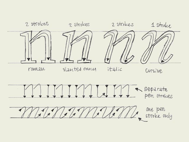
อ้างอิงรูปภาพและคำอธิบาย :

Reference image and description :

Italic vs. cursive
http://www.typeworkshop.com/index.php?id1=type-basics&id2=&id3=&id4=&id5=&idpic=07#pictloader%20


3. ตัวสคริปต์ (Script)

ตัวพิมพ์ที่อิงการเขียนแบบคัดลายมือในตัวละตินหรือตัวภาษาอังกฤษนั้นจุดเด่นคือการเขียนติดกัน แต่ก็ไม่จำเป็นว่าทุกๆ ตัวสคริปต์จะต้องเขียนติดกัน อาจจะพูดถึงตัวที่เขียนแบบตามลายมือก็ได้เช่นกัน


อ้างอิง :

Reference :

Script Typeface: Types and Font Knowledge
https://procreator.design/blog/script-typeface-types/#:~:text=A%20script%20typeface%20is%20based,a%20brush%20while%20connecting%20letters.

Script typeface
https://en.wikipedia.org/wiki/Script_typeface


Screenshot of 4. ลิเกเจอร์ (Ligature), คอนเท็กซ์ (Context), ดิสเพลไทป์ (Display Type)

4. ลิเกเจอร์ (Ligature)

คำว่า ‘ลิเกเจอร์’ ในไทโปกราฟีหมายถึง ตัวพิมพ์หนึ่งตัว (glyph) ที่มีตัวอักษรตั้งแต่สองตัวขึ้นไปเชื่อมรวมกันอยู่
The term ‘ligature’ in typography refers to a single glyph that consists of two or more letters joined together.


อ้างอิงรูปภาพจาก :

Image reference :

Basics of Ligature in Typography and Publishing
https://www.thoughtco.com/ligature-in-typography-1078102

วิดีโอแนะนำให้สามารถศึกษาเพิ่มเติม:
Recommended videos for further study:

What is Ligature
https://www.youtube.com/watch?v=Wf4GQUW1ebk&t=6


5. คอนเท็กซ์ (Context)

องค์ประกอบโดยรอบของตัวหนังสือ ในกรณีนี้คือ คำที่ตัวหนังสือหรือลิเกเจอร์นั้นถูกนำไปใช้งาน
The surrounding elements of the letters. In this case, the words in which the letters or ligatures are used.

6. ดิสเพลไทป์ (Display Type)

ตัวหนังสือหรือฟอนต์ที่ออกแบบสำหรับใช้งานเป็นตัวพาดหัวเป็นหลัก เน้นความโดดเด่นสะดุดตาและใช้ได้ดีในขนาดพอยต์ไซด์ใหญ่
Letters or fonts designed primarily for use as headlines. They emphasize being striking and eye-catching, and work well in large point sizes.


For further reading : 

สามารถอ่านเพิ่มเติมได้ที่ :

Disaply Type
https://en.wikipedia.org/wiki/Display_typeface


7. หนังสืออักษรลายศิลป์

รวบรวมโดย เสน่ห์ ธนารัตน์สฤษดิ์
เขียนแบบโดย เสกสรร ธนารัตน์สกฤษดิ์
สำนักพิมพ์ พิทยาคม
ปีที่พิมพ์ พ.ศ. 2516

Thai Artistic Lettering Book (Thai language only)
Compiled by Sanae Thanaratsadi,
written by Saekson Thanaratsagrit,
Pityakhom Publishing House,
published in 1973

8. โลว์คอนทราสต์ & ไฮคอนทราสต์ (Low Contrast & High Contrast )

โลว์คอนทราสต์คือ แบบตัวพิมพ์ที่มีความหนาบางของเส้นแนวนอนและเส้นแนวตั้งดูพอๆ กัน
ไฮคอนทราสต์คือ แบบตัวพิมพ์ที่มีความหนาบางของเส้นแนวนอนและเส้นแนวตั้ง แตกต่างกันอย่างชัดเจน

Low contrast refers to typefaces where the thickness of horizontal and vertical strokes appears relatively similar. High contrast refers to typefaces where the thickness of horizontal and vertical strokes differs markedly.


อ้างอิงรูปภาพจาก :

Image reference :

Minakata, Katsumi & Beier, Sofie. (2022). The dispute about sans serif versus serif fonts: An interaction between the variables of serif and stroke contrast ☆. Acta Psychologica. 228. 10.1016/j.actpsy.2022.103623.
https://www.researchgate.net/figure/The-four-font-conditions-developed-for-this-experiment-The-low-stroke-contrast-fonts_fig3_360964432

สามารถอ่านบทความเพิ่มเติมได้ที่ :
For further reading, see:

Contrast in a typeface refers to the stroke modulation between verticals (downstrokes) and horizontals (upstrokes)…
https://bruno-maag.medium.com/contrast-in-a-typeface-refers-to-the-stroke-modulation-between-verticals-downstrokes-and-531fb8e3e65d


9. ไฮราคี (Hierarchy)

การจัดลำดับความสำคัญในการอ่าน เช่นเห็นตัวพาดหัวก่อน จากนั้นเป็นตัวรอง แล้วจึงค่อยเป็นตัวอ่าน เป็นต้น

The prioritization of reading order, such as seeing the headline first, then the subheading, followed by the body text, and so on.


สามารถอ่านบทความเพิ่มเติมได้ที่ :

For further reading, see:

Applying Type
https://m3.material.io/styles/typography/applying-type

Typographic Hierarchy: What is it, and why is it important?
https://www.turing.com/kb/typographic-hierarchy


10. โฟโต้ไทป์เซตติ้ง (Phototypesetting) 

การพิมพ์โดยใช้เทคนิคการฉายแสงลงบนแผ่นฟิล์ม
Printing by using light projection technology on film plates


สามารถอ่านบทความเพิ่มเติมได้ที่ :

For further reading, see:

ความหินในการทำหนังสือยุคก่อนคอมพิวเตอร์ เมื่อกราฟิกคืองานคราฟต์ระหว่างบรรทัด
https://thematter.co/life/graphic-before-computer-come/37513

The first phototypesetting machine
https://typenetwork.com/articles/morisawa-100th-anniversary


11. เลทเทอริ่ง (Lettering) 

งานออกแบบตัวหนังสือเฉพาะกลุ่มคำเฉพาะ ที่ส่วนมากแล้วจะมีลูกเล่นที่ไม่ได้พบเห็นหรือเกิดขึ้นกับฟอนต์หรือตัวพิมพ์ทั่วไป Lettering อาจจะถูกนำมาใช้เป็นหน้าปกหนังสือ ชื่อหัวข้อวิดีโอ หรือชื่อเรื่อง ชื่อตอนในแม็กกาซีน เป็นต้น และหรือสามารถถูกนำไปใช้เป็นโลโก้ได้ ซึ่งในทำศัพท์ของ graphic design จะเรียกโลโก้ชนิดนี้ว่า wordmark

Lettering is the design of letters specifically for a particular group of words, which typically features decorative elements or stylistic flourishes not found in regular fonts or typefaces. Lettering may be used for book covers, video titles or headings, magazine article titles and episode names, etc. It can also be used as a logo, which in graphic design terminology is called a wordmark.


สามารถดูวิดีโอเพิ่มเติมได้ที่ :
For more on this topic, watch :

Typography, Type Design, Lettering และ Calligraphy ต่างกันอย่างไร? | Type Family Season 1 EP.1 https://www.youtube.com/watch?v=q-nH_ggIaqA

หนังสือที่แนะนำในการเรียนวาด Lettering ด้วยตัวเอง :
Recommended book for learning lettering drawing on your own :

House Industries lettering manual by Ken Barber
https://houseindustries.com/hi/house-industries-lettering-manual


12. เคาน์เตอร์ (Counter Shape) 

พื้นที่ในตัวหนังสือในไทโปกราฟีเราจะเรียกว่า เคาร์เตอร์เชป (Counter Shape)

The space within letters in typography is called the counter shape.


อ้างอิงรูปภาพจาก :

Image reference :

Understanding Counter in Typography (A Comprehensive Guide)
https://www.ofspace.co/blog/counter-in-typography

หนังสืออ่านแนะนำ :
Recommended book to read :

Counterpunch: making type in the sixteenth century, designing typefaces now by Fred Smeijers


13. เอ็กซ์เพรสซีฟ (Expressive) 

ในบริบทนี้ต้องการสื่อว่าตัวหนังสือมีหน้าตาที่สื่อสารอารมณ์ออกมาต่อผู้อ่านอย่างชัดเจน ในปัจจุบันนี้ ในบริบทของไทโปกราฟี คำว่าเอ็กซ์เพรสซีฟหมายถึงตัวหนังสือที่มีลูกเล่น ไดนามิก โดดเด่นอย่างชัดเจน เช่น ที่มีการรวบรวมไว้ในหนังสืออย่าง Expressive Type Today by Counter-Print เป็นต้น

In this context, it means that the letters have an appearance that clearly communicates emotion to the reader. In contemporary typography, the term ‘expressive’ refers to letters that feature decorative elements, are dynamic, and distinctly striking, such as those compiled in books like ‘Expressive Type Today’ by Counter-Print.


Update:
30 สิงหาคม พ.ศ. 2568
30 August 2025